The Color of Calm — The Psychology of Hue and Harmony
Share
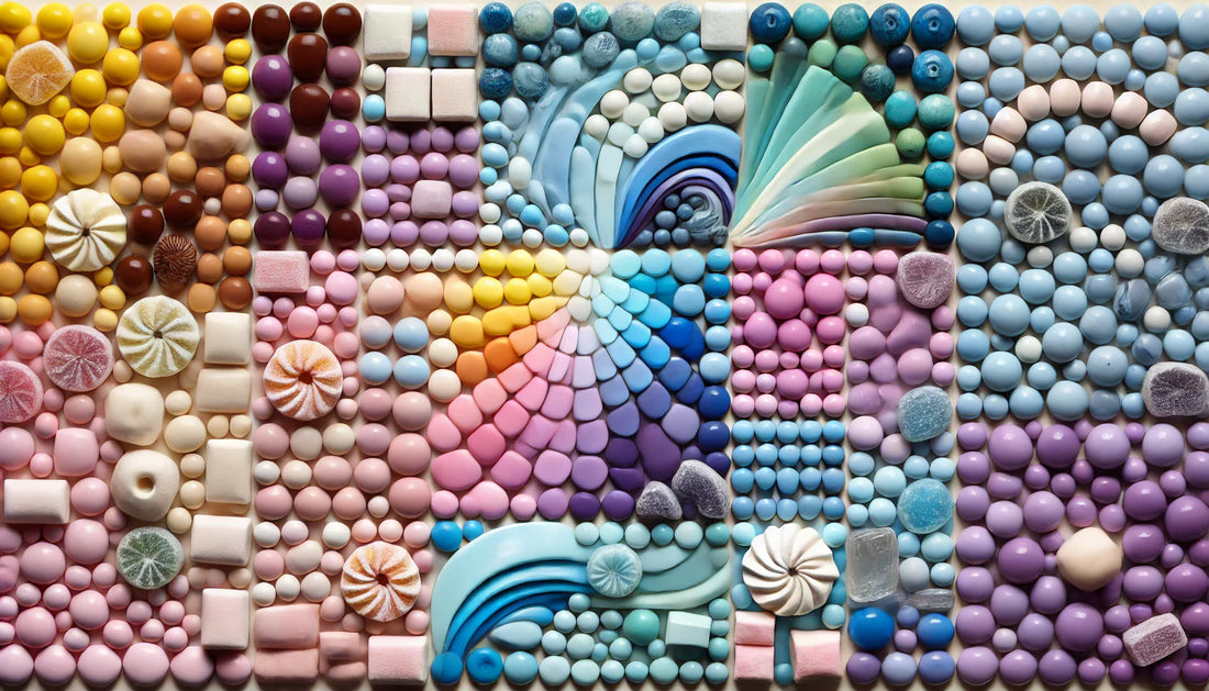
Color is emotion materialized.
It hums, whispers, or shouts depending on how we listen. A single shade can summon entire memories — the soft ivory of morning paper, the deep green of rest after rain.
The Cozy Havens sees color not as decoration but as dialogue — between emotion and environment, rhythm and rest.
To color a room is to color the soul that dwells within it.
1) The Language of Tone
Blue steadies thought.
Beige quiets time.
Green restores rhythm.
Color, when chosen deliberately, becomes therapy disguised as design.
The Cozy Havens favors muted palettes not for modesty but for longevity — tones that age gracefully, hues that breathe without tiring the eye.
Q & A
Q: Why do neutral tones calm the mind?
A: Because neutrality invites imagination. The mind expands where color does not shout.
2) The Rhythm of Contrast
Too much sameness suffocates; too much contrast confuses.
Harmony arises from restraint — the gentle friction between light and depth.
A soft wall beside a dark oak frame, linen curtains meeting steel accents — tension as tranquility.
Q & A
Q: How do I find the right balance of color?
A: Think of music. Each tone must rest between silence and sound.
3) The Seasonal Palette
Homes, like nature, should shift hues with time.
Winter calls for warmth; summer for clarity.
A living space evolves in shade as life evolves in mood.
Q & A
Q: Should I repaint with every season?
A: Not paint — perception. Change textiles, not walls. Let light become your artist.
Conclusion
To live beautifully is to see gently.
Color, when guided by calm, restores humanity’s oldest need — balance between the seen and the felt.
The Cozy Havens paints with emotion, not pigment. Because true color never fades — it settles.